Showing posts with label You Can't Judge A Book By Its Cover. Show all posts

Friday, December 11, 2020

You Can't Judge A Book By Its Cover #342

-You can't judge a book by its cover - which is very true.
 But you can like one cover version better than another...

US cover
UK cover
Harriet Tyces'  new novel is the Lies You Told. The US cover is on the left and the UK cover is on the right. Now at first glance, you might have thought I inserted the same photo twice. Well the same 'frame' has used on both cover with the same  ivy details. Differences - the windows themselves - six panes vs 12 panes. I wonder why? We've got subdued lighting in the US window, but much brighter in the UK window. A lone woman is planted in each window, but on opposite sides with one looking out and one looking in. I'm not a fan of either, but will go with the UK cover this week, solely based on the warmer light. What about you? Which cover do you prefer? Any plans to read The Lies You Told? 
You Can't Judge A Book By Its Cover is a regular feature at A Bookworm's World.

Friday, November 27, 2020

You Can't Judge A Book By Its Cover #340


You can't judge a book by its cover - which is very true

But you can like one cover version better than another...
UK cover

US cover
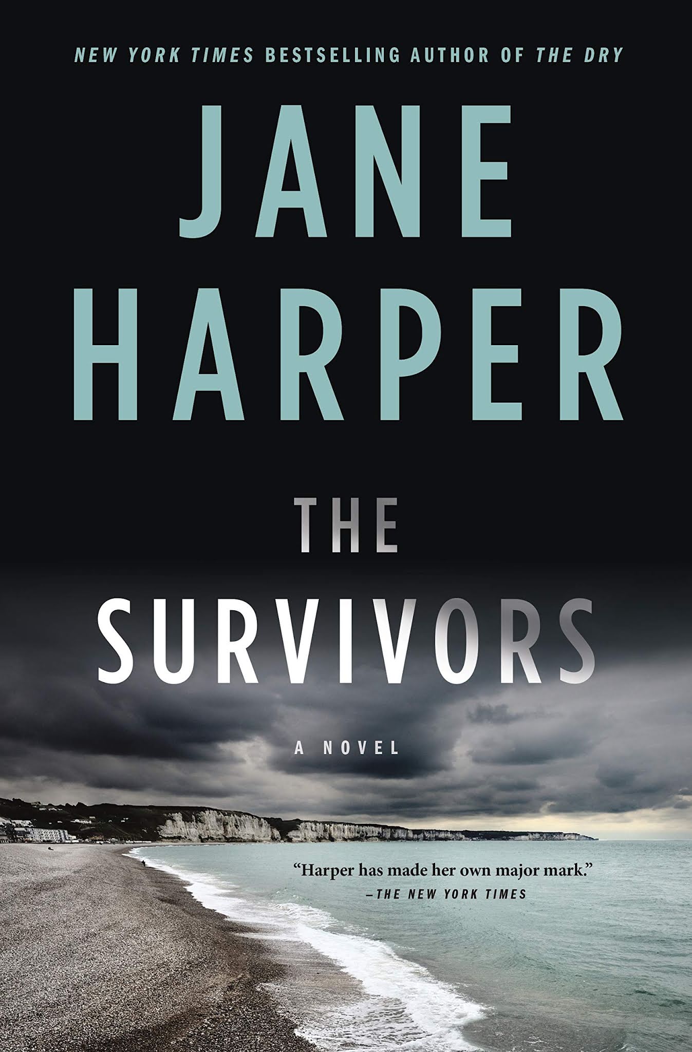
I've not read Jane Harper before, but a blurb from Val McDermid has me thinking I should. Harper's new book The Survivors comes out at the top of next year. The US cover is on the left and the UK cover is on the right. "When a body is discovered on the beach, long-held secrets threaten to emerge in the murder investigation that follows. A sunken wreck, a missing girl, and questions that have never washed away..." Well, with that snippet, both covers seem well matched to the story inside". The US cover is a long shot of a flat coastline. The UK cover seems to be looking down from a cliff perhaps with a cave? The sea is much calmer on the US shot while the UK waves seem much more dangerous. The dark sky on the US cover does seem ominous. I think both covers are good this week, but I like the UK cover just a bit better. What about you? Any plans to read The Survivors? Which cover do you prefer? You Can't Judge A Book By Its Cover is a regular feature at A Bookworm's World.


Friday, November 20, 2020

You Can't Judge A Book By Its Cover #339

-You can't judge a book by its cover - which is very true. 
But you can like one cover version better than another...

US cover
Canadian cover
There's a new Inspector Banks coming next year from Peter Robinson. Not Dark Yet will be the 27th entry and releases in Spring 2021. This is one of my fave series, so it's definitely on my TBR list. The US cover is on the left and the Canadian cover is on the right. Interestingly the same image has been used on both covers. The difference being in the view. The US cover is close up on the rocky image, specifically the opening while the Canadian cover gives us a long range view. The Canadian version has the last bits of a sunset visible which matches the title - not dark yet. The US cover shot feels ominous to me with the storm clouds just visible. I'm drawn to beaches and would happily be walking down to the rock formation to see it clearer - and what might be on the other side. The font used on the Canadian cover seems to pack more of an impact IMO. Both have pluses, but I'm going to go with the Canadian cover this week. What about you? Any plans to read Not Dark Yet? Which cover do you prefer?
You Can't Judge A Book By Its Cover is a regular feature at A Bookworm's World.

Friday, November 13, 2020

You Can't Judge A Book By Its Cover #338

-You can't judge a book by its cover - which is very true. 
But you can like one cover version better than another...

US Hardcover
US Kindle
Lars Kepler is a husband/wife writing duo. I quite enjoy their 'Joona Linna' series, set in Sweden.
Lazarus is the sixth entry. Now, I did find another cover - but it had a snake on it and I just didn't want to look at it. So - today we have the US Hardcover on the left and the US Kindle on the right. Let's see...the black and red on the hardcover absolutely works for a murder mystery. The red looks like bloody slashes and the word Lazarus fades out from top to bottom. Also works well for a murder mystery. The green on the Kindle cover is, umm, different. Lazarus rose from the dead, so maybe that the green choice? For living. Although I find the green a little science fictiony. And I believe those are tombstones in a graveyard setting. Which suits the premise of the book. Hmm, I think I'll go with the US hardcover this week. What about you? 
Which cover do you prefer? Any plans to read Lazarus?
You Can't Judge A Book By Its Cover is a regular feature at A Bookworm's World.

Friday, November 6, 2020

You Can't Judge A Book By Its Cover #337

- You can't judge a book by its cover - which is very true. 
But you can like one cover version better than another...

US cover
UK cover
Piece of My Heart by Mary Higgins Clark and Alafair Burke releases in a few weeks on both sides of the pond. The US cover is on the left and the UK cover is on the right. Okay...I do like the color used on the US cover. And the image of the skull is great, especially when made of pretty flowers. The font style and color also work on the turquoise. Well, I feel like I've seen the UK cover many times before. Lone woman seen from the back in an isolated area. It's boring and overdone. So an easy choice for me this week - US. What about you? Which cover do you prefer? Any plans to read Piece of My Heart?
You Can't Judge A Book By Its Cover is a regular feature at A Bookworm's World.

Friday, October 30, 2020

You Can't Judge A Book By Its Cover #336

-You can't judge a book by its cover - which is very true.
 But you can like one cover version better than another... 

US cover
UK cover
Nicci French has just released her/his latest book, House of Correction. Sounds ominous, so let's see if the cover matches the title. The US cover is on the left and the UK cover is on the right.The title takes precedence over the author's name on the US cover, but is reversed on the UK cover. The red font on the US cover is more 'deadly'. The rain and colour of the sky seems suitable. Having read the premise of the book, I'm not sure of the image use. The meal roofed shack looks like a fisherman's storage shed by the sea. The colour used on the UK cover is a hideous hospital green. A cover blurb gives you a bit more and the cover itself is a door. A prison door as we can see the bars.
I'm not a fan of either, so went looking to see if there was another option. And there is - so my vote this week is for the Australian cover below. Great blurb, good simple image that draws you to it. What about you? Which cover do you prefer? Any plans to read House of Correction?
You Can't Judge A Book By Its Cover is a regular feature at A Bookworm's World.

Australian cover


Friday, October 23, 2020

You Can't Judge A Book By Its Cover #335

- You can't judge a book by its cover - which is very true. 
 But you can like one cover version better than another...

US cover
UK cover
I pretty much read anything Harlan Coben writes. His original series was the Myron Bolitar books. And Myron's sidekick is Windsor Horne Lockwood III, also known as Win. Coben has slowly added details about this character in each new book. And I was thrilled to see that he will be the star at last. Win releases in March on both sides of the pond. The US cover is on the left and the UK cover is on the right. Okay.....The colors on the US cover are certainly eye-catching. I like not having a face and just a back view - keeps the mystery of the character alive. The blood spatter is a nice touch. It does remind me a bit of Dexter. The orange of the font for the author's name is what the eye is drawn to first on the UK cover and then the book's name. I liked the tagline - "If you lose you die" So you better "Win". The ominous gates are a grabber, as is that dark sky. What's he going to find down the path.
I'm torn this week - I do like both, but in the end I'll go with the UK cover. What about you? Which cover do you prefer? Any plans to read Win?
You Can't Judge A Book By Its Cover is a regular feature at A Bookworm's World.

Friday, October 16, 2020

You Can't Judge A Book By Its Cover # 334

-You can't judge a book by its cover - which is very true. 
But you can like one cover version better than another...

UK cover
US cover
 I was excited to see that C.J. Tudor has a new book coming out! I've enjoyed all of her previous titles and this one looks to be just as creepy. The Burning Girls publishes in early 2021 on both sides of the pond. The US cover is on the left and the UK cover is on the right. Well, given that burning is in the title, it's no surprise that fire is featured on both covers. The tones, orange and red, both relate to fire. The US has decided to use a drawn image. There's a few hints at the centre of the picture. That is indeed a church at the centre of the flames. The flames themselves kind of bring a hand to mind. The edges of the title and author font are broken, adding to the destructive feel. Now, on to the UK cover. The red just pops and grabs your attention right away. A realistic picture has been used and I think it's brilliant. A burning house shape made out of lit and charred matchsticks. That one flame still burning, knowing it will encompass the entire 'structure' is ominous. Loved it - so an easy choice for me this week. UK cover. What about you? 
Which cover do you prefer? Any plans to read The Burning Girls?
You Can't Judge A Book By Its Cover is a regular feature at A Bookworm's World.

Friday, October 9, 2020

You Can't Judge A Book By Its Cover # 333

- You can't judge a book by its cover - which is very true. 
 But you can like one cover version better than another...
UK cover
US cover

I'm so excited! The next entry (13th) in Elly Griffiths' wonderful Ruth Galloway series has been announced - The Night Hawk. UK readers - you can grab your copy in the February 2021. NA, we'll be waiting until June. But...it will be  most definitely worth the wait! The US cover is on the left and the and the UK cover is on the right left. So the first thing you might notice is that there's an S on the US cover, but not on the UK cover. I believe this is an error on one side or the other. The US cover follows previous looks for this series, including the skull logo. This image however doesn't say England or Salt Marsh to me. Instead it looks like a rundown barn in a forest setting.  Now to be fair, an isolated farm is part of the plot. The UK cover takes us to a setting more like what I would expected. The life preserver says we are close to the sea. And indeed that is part of the plot as well. That sky is wonderfully dark and stormy. Not sure if that one lit window was necessary though. It's getting overdone. I prefer the font and style on the UK more. The up and down mis sized letters on the US cover don't appeals to me. And easy choice for me this week - UK. What about you? Which cover do you prefer? Are you a Ruth Galloway reader?
You Can't Judge A Book By Its Cover is a regular feature at A Bookworm's World.

Friday, October 2, 2020

You Can't Judge A Book By Its Cover #332

- You can't judge a book by its cover - which is very true. 
But you can like one cover version better than another...

UK cover
US cover
Ahh, another one I'd love to read - but the TBR list is getting out of control. John Banville's latest, Snow, releases at the  beginning of October on both sides of the pond. The US cover is on the left and the UK cover is on the right. Hmm, I like them both this week! The house on the US cover looks like it's hiding secrets. I like the one upper window that lit as it illuminates the snow falling. The one toned cover of the UK book is appealing as well. It seem all the more ominous for that one color. The author's name is 'snow.' But the piece de resistance is that blood dripping from the title on the UK cover. So I will go with the UK cover this week. What about you? 
Which cover do you prefer? Any plans to read Snow?
You Can't Judge A Book By Its Cover is a regular feature at A Bookworm's World.

Friday, September 25, 2020

You Can't Judge A Book By Its Cover #331

- You can't judge a book by its cover - which is very true.
But you can like one cover version better than another...

US cover
UK cover
Lisa Unger's newest book, Confessions on the 7:45, releases this fall. And I've got it on my TBR list. Why? I love mysteries that happen on a train. The Hitchcocks, The Woman on the Train etc. I'm looking forward to seeing what Unger has planned for her train ride. The US cover is on the left and the UK cover is on the right. Two different tones this week - the US cover is somewhat sepia and I think the blurred window is great. We don't clearly see the woman's face (thank goodness).We're outside looking in on her. The UK cover is much brighter in tone. The red coat stands out. This time it's the woman on the outside looking at the train, waiting to board. I'm going to go with the US cover this week - I prefer the subtle tones.
What about you? Any plans to read Confessions on the 7:45? 
Which cover do you prefer?
You Can't Judge A Book By Its Cover is a regular feature at A Bookworm's World.

Friday, September 4, 2020

You Can't Judge A Book By Its Cover #328

- You can't judge a book by its cover - which is very true.
But you can like one cover version better than another...

US cover
UK cover
Tana French is a brilliant writer. I've enjoyed all of her books and am looking forward to the Oct./Nov. release of The Searcher. The US cover is on the left and the UK cover is on the right. The title alone says there's someone or something missing. Both covers seem to suggest a where. The heavy clouds and seemingly endless field are a place to get lost in. I like the overall green tone - for me it says a storm is brewing. The stark black and white of the UK cover is very effective. Again there is an endless forest behind the isolated cabin. I do wish there wasn't the one lit window - that's been overdone. They're both really great looks, but I'm going to go with the US cover this week. What about you?
Any plans to read The Searcher? Which cover do you prefer?
You Can't Judge A Book By Its Cover is a regular feature at A Bookworm's World.

Friday, August 28, 2020

You Can't Judge A Book By Its Cover #327

- You can't judge a book by its cover - which is very true.
But you can like one cover version better than another...

US cover
Australian cover
A new Michael Connelly book is on the way! The Law of
Innocence releases in November. It's the seventh book in the Lincoln Lawyer series. And it's most definitely on my must read list. The US cover is on the left and the Australian cover is on the right. Okay...there's a dirty, gritty looking underpass on the US cover. Looking closer the dark items on the left hand side are a shopping cart and one or two homeless individuals. The light is blinding coming in the other end. The cover does indeed have to do with driving. The Australian cover gives us a night view - this time of a lit up city. It looks prosperous compared to the US cover. But the best part? Yeah, it's that black, '80's-vintage Cartier edition Lincoln Town Car that stands out. I love the idea of a mobile office. And I can only imagine cruising around in this beauty. Okay, so guess which cover I like? Uh huh, the Australian cover for me this week. What about you?
Any plans to read The Law of Innocence? Which cover do you prefer?
You Can't Judge A Book By Its Cover is a regular feature at A Bookworm's World

Friday, August 21, 2020

You Can't Judge A Book By Its Cover #326

- You can't judge a book by its cover - which is very true.
But you can like one cover version better than another...

UK cover
US cover
I'm eager to read Romy Hausmann's novel Dear Child. It's a bestseller in Germany and is garnering praise in North America. This descriptor caught my eye - "Room meets Gone Girl ..." The US cover is on the left and the UK cover is on the right. Ok, right off the bat, the crayon coloring and printing just says a child is involved. The Xing out of the tiny house in telling as well. You can gather a lot of the plot from this cover I think. The UK has chosen a starker look. The title in red ink says danger. And the house is made from sticks and looks to be falling down. Definitely creepy. There's also three blurbs from some big name authors. This week I'm going to go with the UK cover. What about you? Any plans to read Dear Child?
Which cover do you prefer?
You Can't Judge A Book By Its Cover is a regular feature at A Bookworm's World.

Friday, August 14, 2020

You Can't Judge A Book By Its Cover #325

- You can't judge a book by its cover - which is very true.
But you can like one cover version better than another...

US cover
UK cover
Val McDermid is known as Britain’s Queen of Crime. She is indeed one of my fave mystery/police procedural authors. She writes a number of series. Still Life is the 6th entry in her Karen Pirie Series. The US cover is on the left and the UK cover is on the right. The water is featured on both covers. One is depicted in a busier locale - I have to believe that significant bridge on the US cover gets lots of use. At first glance I thought the bright fish pots on the US cover was a blanket! Ominous skies on both, but the blue on the US cover seems too fake for me.  A quieter tone on the UK cover, which I quite like. That seemingly never ending view is strangely appealing to me. The empty boat has lots of possibilities. So an easy choice this week - UK cover. What about you? Which cover do you prefer? Any plans to read Still Life?
You Can't Judge A Book By Its Cover is a regular feature at A Bookworm's World

Friday, August 7, 2020

You Can't Judge A Book By Its Cover #324

- You can't judge a book by its cover - which is very true.
But you can like one cover version better than another...

US cover
UK cover
I adored Anthony Horowitz's Magpie Murders. (my review). I was excited to see that there's a new Atticus Pund mystery coming out in November in NA, August in the UK. The US cover is on the left and the UK cover is on the right. Alright, lets get started. Two bold background colors on both covers. I do find the red moire appealing that the blue. As to images, the UK does have a moon referencing the title. Night scene, bare branches - and an owl - with one of the worst owl faces I've ever seen. It looks like he hit a building straight on and flattened out his face even more. Hmm, do you sense what cover I'm liking this week? The key image against the red makes me want to see what's inside. And the four little images - a (moon?) flower, a book, an X (marks the spot) and a hammer (murder weapon anyone?) And look at the left hand side cut out on the key - do you see the face. A most excellent cover - and an easy choice for me this week - US. What about you? Which cover do you prefer? 
Any plans to read Moonflower Murders?
You Can't Judge A Book By Its Cover is a regular feature at A Bookworm's World.
Friday, July 31, 2020

You Can't Judge A Book By Its Cover #323

- You can't judge a book by its cover - which is very true.
But you can like one cover version better than another...

UK cover
US cover
It was this recommendation for Felicity Hayes-McCoy's
forthcoming book, The Transatlantic Book Club that caught me eye..."perfect for fans of Jenny Colgan". That's me! I do love a good rom-com series. The US cover is on the left and the UK cover is on the right. Big plus for the US cover is not showing the woman's face! I like the background of hills and buildings. And putting the title of the book, on the book, is clever. It's a bright and cheerful look and I would be enticed into picking it up. The UK cover does seem to follow a look. The same hills and village are there. This time we're given a figure instead of a face. And a blurb "Distance Makes No Difference to Love" lets you know it's a romance. Hmm, this week I'm going to go with the US cover - the bright colours are just more inviting for me. What about you? Which cover do you prefer? Any plans to read The Transatlantic Book Club?
You Can't Judge A Book By Its Cover is a regular feature at A Bookworm's World.

Friday, July 24, 2020

You Can't Judge A Book By Its Cover #322

- You can't judge a book by its cover - which is very true.
But you can like one cover version better than another... 

US cover
UK cover
I like Nick Hornby's stories. His new one, Just Like You,
releases in September 2020 on both sides of the pond. "This warm, wise, highly entertaining twenty-first century love story is about what happens when the person who makes you happiest is someone you never expected." The  US cover is on the left and the UK cover is on the right. Now at first glance, you may be saying - 'Hey Luanne, you posted the same cover twice! Close, but not quite. And right off the bat, I wonder why so close and yet changed? Which cover was first? Okay, let's start. The addition of red and orange really brightens up the US cover. The brown and washed out pink on the UK cover just says blah to me. And the author's name looks wishy washy as well. Now here's the interesting bit - doesn't the US cover look like the two figures are fully dressed. Uh huh. Now look at the UK cover. The pink color block is lowered - and it looks like the figures are both in their underwear. And they're floating in some sort of lava pit. Awkward. Easy choice for me this week - US. What about you? Which cover do you prefer? Any plans to read Just Like You?
You Can't Judge A Book By Its Cover is a regular feature at A Bookworm's World.

Friday, July 10, 2020

You Can't Judge A Book By Its Cover #320

You can't judge a book by its cover - which is very true. 
But you can like one cover version better than another...

US cover
UK cover
Lauren Beukes's new novel Afterland has already released - and its definitely on my TBR list. I quite like apocalyptic tales. The US cover is on the left and the UK cover is on the right. Two very different looks this week - blue skies and a flower vs. what looks to be a catastrophic volcano/bomb/burning something.  Light vs. dark. Knowing the premise, I would say that the UK cover is closer to the story inside. But, I like the US cover too. I'm a sucker for bright pink. But with that flower, I would have been thinking 'break up story.' 
Both covers have a blurb from George R.R. Martin. Ahh, a tough call this week. For 'just because it catches the eye more', I'm going to go with the US cover. What about you? Which cover do you prefer? Have you read Afterland?
You Can't Judge A Book By Its Cover is a regular feature at A Bookworm's World.

Friday, July 3, 2020

You Can't Judge A Book By Its Cover #319

- You can't judge a book by its cover - which is very true.
But you can like one cover version better than another... 

US cover
UK cover
I loved Ruth Hogan's previous book, The Keeper of Lost Things. I'm looking forward to reading her new release, Queenie Malone's Paradise Hotel. The US cover is on the left and the UK cover is on the right. So....a similar look on both covers with the cladding (or maybe ship lap lol), the crown in the upper left, a few flowers on the edge of the UK cover compared with the window box filled with climbing flowers. I think this week it's going to come down to colour preference. I do like the blue of the US cover, but I like the multi coloured UK a bit more. And that little hotel at the top - it's hard to see, but it says Brighton Pier. So, UK for me this week. What about you? Which cover do you prefer. Any plans to read Queenie Malone's Paradise Hotel?
You Can't Judge A Book By Its Cover is a regular feature at A Bookworm's World.